How to Create A KPI Dashboard in Tableau

How to Develop a KPI Dashboard in Tableau
Note: This post is fifth part of Building KPIs dashboard Series.
IV. Wireframing A Dashboard
VI. Best practices for KPI analysis
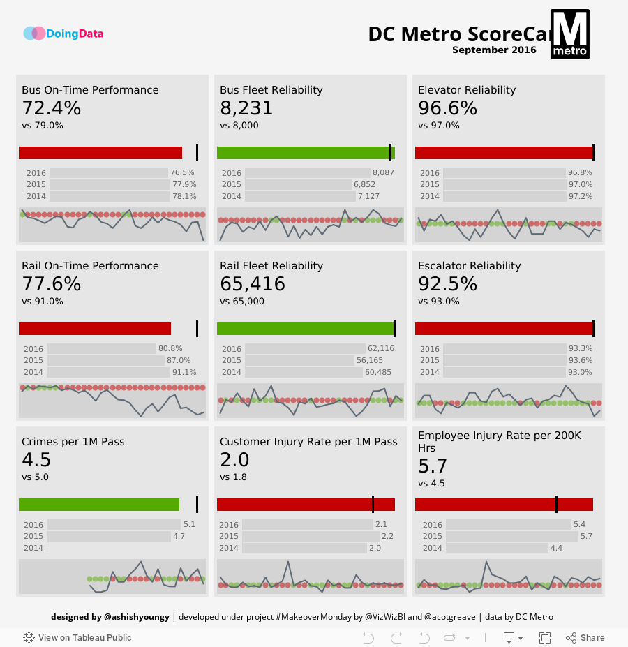
Today's #MakeoverMonday was awesome. We were supposed to improve upon a KPI scorecard for Washinton DC Metro service. Here is what I made:
I got a few positive nods from the community and as the encouragement, I would like to share with you how I made the scorecard above.
The 'Makeover' Part
The most important thing about a MakeoverModay is the 'Makeover'. Because we are always improving upon a previously created visualisation, we are always under pressure to come up with a better one the what was earlier created. The original one published on DC Metro's website was a good one actually, except it violated some of fundamentals of data visualisation and had some vibility problem:
Radial bar charts are problematic with absolute numbers
Dashboard at the glance isn't showing trends
I encourage you to skim through definitions of KPIs used in the dashboard in page 1 of this document before you read further because unless you understand what you are creating, it isn't much useful to understand how you are creating.
Data Preperation
Done? Great. Let's get back to dashboard design now. The very first problem happened when I downloaded the data and had a look at it. The data was in a wide format. 9 KPIs to be tracked and and each KPI has target and actual so data ended up with 9 X 2=18 columns. Tableau hates wide format data (or at least I do). So we will have to transpose data to use in the Tableau. Fortunately, when connected to Excel, Tableau let's you transform and pivot the data from wide format to tall format, so that's what I did
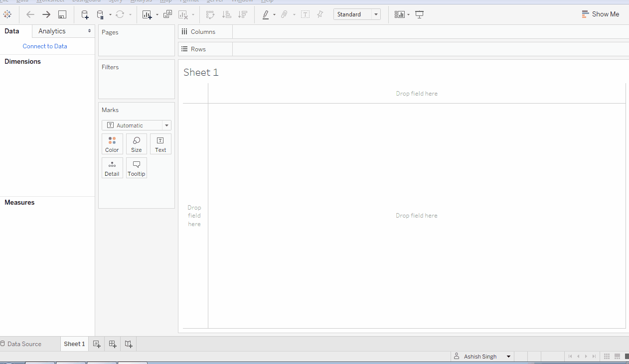
Pivot Excel data in Tableau Add Data Source windows
Now the layout of the data is goal, month, value so each goal is divided into target and actual which are further divided into time series. Since column names have become dimension after pivoting the data, we will have to identify which rows belong to target and which belong to actual. A little text cleaning is also required. Write these three calculations to accomplish goals:


Also, we are going to need a month column to create time-series analysis. We have Year and Month columns in the data. Let's examine them and see if they can be of any help
Year: CY 2014, CY 2015, CY 2016
And each year has data broken by months and also a subtotal for YTD
Month: Jan, Feb, Mar, Apr, May, Jun, Jul, Aug, Sep, Oct, Nov, Dec, YTD
Which looks okay to me, we will need to write another DATEPARSE calculation to use these text fields to create a date filed named Months:

Data Visualization
Voila! The fun begins now. Let's start with goals to be accomplished with the visualization
To glance performance of each of 9 KPIs against the target
To understand if performance is improving over the period of time
To the deviation from the target and the trend of deviation
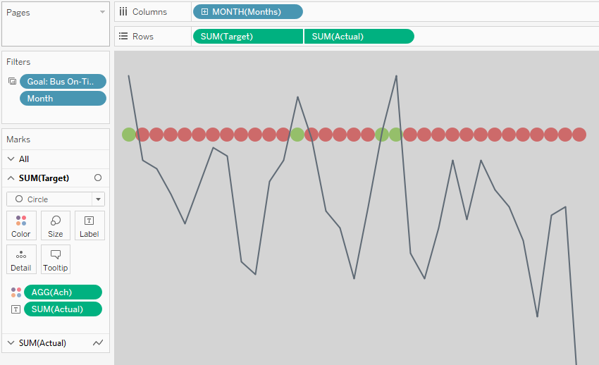
Looks pretty OK for a KPI Dashboard. Let's get started with creating a blueprint, though some of you might not be used to the concept of creating a blueprint before you design, I always find it a pretty good idea to create a design-skeleton before we actually get into work
For every KPI, there is a block, and within every block, there are four charts stacked vertically
Chart 1 - Text Chart: latest month target vs actual
Chart 2 - Bullet Chart: color coded target vs actual for latest month
Chart 3 - Bar Chart: macro changes in metric performance over years. YTD values only
Chart 4 - Sparkline: month of month target vs actual with colour code (how to create sparkline)
And finally put all pieces together and bind them into a pixel perfect single dashboard. This is it.
Current Month Text Charts
Currently target and actual are seperated by a domension Value Type. Calculate these two measures for target and actual separately
Actual : IF [Value Type] = 'Actual' THEN [Pivot Field Values] END
Target : IF [Value Type] = 'Target' THEN [Pivot Field Values] END
And also a set to be used in filter for latest month

This is the configuration for the text chart on the top

Duplicate the sheet 9 times and filter each goal in each sheet, thus you will have 9 sheets each with metric for a different KPI
Current Month Bullet Chats
This is plainly a bar chart with a reference line. Length of bar chart is equal to actual and reference line is placed at target position. Further actual bar is colour coded with target achievement. If achievement is less than 100% then make the bar red, else green. Here is the configuration:

Make 9 copies of this chart as well for each goal
While colour coding you have to keep two things in mind. There are targets which you always want to exceed like On Time Performance. So if the actual value is greater than target then the colour code is green else red. However, there are safety metrics like crimes which are green if they are below the target and red of above the target. So for these inverse metrics use reverse option in on Color Marks. These are the inverse metrics for your reference:
Crimes per 1 Million Passengers
Customer Injury Rate per 1 Million Passengers
Employee Injury Rate per 200K Hours
Ghost Bar Charts
Yeah, Ghost Bars, (as in noun). I made those three greyed out bars keeping in mind that end user will look at those graphs only on demand. Also, data is not going to change very frequently in them. Only current year YTD chart will change every month and old years data will never change. So sort of, after some time, end user will remember the values on them already. I know I started preaching end user design which I should not, at least not in this post. BTW, Andy Cotgreave loved those ghost bars ;)
Here is the layout for Ghost Bars. Only thing you need to remember about this chart is that filter out all other months except the 'YTD' entry because we already have YTD subtotal in the data

Recipie: Light Grey Bars + Lighter Grey BG + Light Grey Labels = Ghost Bars :D
MoM Sparklines
This is a simple sparkline with dual axis. Doesn't need much explanation, so here is the configuration:
Don't forget to make target circles 50% transparent and invert colors for those three inverse metrics
Put It Together
Alright! Congratulations. You have ingredient ready in the form of 36 charts (four for each goal). Now is the time to put them together. Refer to the blueprint once again.
Create a dashboard sheet and float 9 vertical container on it in a 3X3 grid
Set size of each container to 232 X 241 (w x h)
Tile 4 charts for each goal in it's container
Edit height of each chart as follows: Chart I 100, Chart II 25, Chart 3 50, Chart 4 50
A little bit of further formatting and pixel perfection and you're good.
I hope you enjoyed reading the first article in the series. Read part II of the series Comparing KPIs. Any questions? Hit below in comments. Cheers.
If you are a project manager and want to hire me to build a KPI Dashboard for your department, contact me to schedule a discussion.